Facebook’s JavaScript library ReactJS has grown substantially since its release in 2013, and ever since then, developers have used ReactJS to build all sorts of applications.
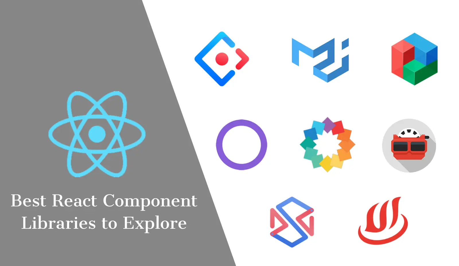
One of the reasons for ReactJS’s popularity is its vast collection of React component libraries. With these super convenient libraries, developers have created some stunning UI for mobile, desktop, web, and hybrid applications.
Thanks to their high modularity, these component libraries can not only streamline the UI development of the app for modern ReactJS developers, but they’re also pretty flexible once you get the hang of them.
React has loads of high-performance component libraries, and this article will highlight some of the most awesome component libraries available.
But, before diving into this please check the top web development frameworks for 2025
What is a React Component Library?
A react component library is a platform that contains a series of components required for building a successful user interface.
The series of components in the React library is based on JavaScript properties and functions.
The react component library empowers app developers to create websites and applications for desktops using Gatsby and Electron respectively.
Apart from this, app developers can also create mobile applications with React Native.
What are the Best React Component Libraries in 2025?
We can understand that finding the best React component library for your project may be challenging but rest assured, you have come to the right place.
We have tried to compile a broad collection of ReactJS component libraries that specialize in elements covering a host of UI components, design frameworks, utilities, animations, and UI layouts in this article.
These react library components are similar and work towards a single goal of helping developers with interactive user interfaces.
However, each of these react library components offers unique features including customized thematic designs and consumer-centric features.
Below is our comprehensive list of the top ReactJS component libraries with a bit of insight about them. Read on-
Material UI

- Github Stars: 63.9k
- Github Folks: 19.7k
- Github For Material UI
Remember Material Design, Google’s widely famous design language from 2014?
Being one of the most popular React component libraries, Material UI takes its inspiration from the same design language and provides implementations for various elements adhering to Google’s Material Design guidelines.
The key takeaway from this component library is that the developers get access to a host of minimalistic, clean, and highly customizable components.
The library also offers a selection of rich ready-to-use components that app developers can plug into their apps without even breaking a sweat.
Apart from providing the necessary components for your app, Material UI also provides a handy collection of tools and APIs designed to optimize your app development.
They also have a remarkable collection of premium themes on their website, if you want something ready to go.
Ant Design

- Github Stars: 65.7k
- Github Folks: 25.9k
- Github For Ant Design
Dubbed as the world’s second most popular React component framework after Material UI, Ant Design focuses on providing design guidelines and elements centered around enterprise-grade applications.
The framework allows developers to pick from over 60 high-quality React components spanning categories like navigation, layout, data entry, data display, feedback, and more.
The components designed by Ant Design are very well thought out and reflect their design philosophy, which focuses on four core design values; Natural, Certain, Meaningful, and Growing.
You’ll find plenty of handy resources, such as valuable design tips, guidelines, clean icons, and Sketch plugins for a range of themes on their website.
The components offered by them have been designed to provide a consistent look and feel for internal applications but React developers are always free to pursue their creativity.
They also offer a mobile-friendly version of Ant Design for React developers creating a mobile app.
React Bootstrap

- Github Stars: 18.8k
- Github Folks: 3k
- Github For React Bootstrap
Bootstrap is a well-known HTML, CSS, and JavaScript library containing elements for creating UI for both mobile and web apps.
While Bootstrap is primarily known as a JS library, React Bootstrap is a complete remodel for React along with the components but without the dependencies on bootstrap.js or jQuery, effectively replacing the JavaScript styles with their React components.
Wondering what makes this the best React component library?
The answer lies in the benefits it provides, which include full compatibility with thousands of already available Bootstrap themes and a lengthy list of components with complete control over each of them.
Thanks to the integration of Bootstrap’s functionality into React’s virtual DOM, React Bootstrap updates the state to the virtual DOM, proving to be a more reliable solution for developers.
Blueprint UI

- Github Stars: 17.8k
- Github Folks: 1.8k
- Github For Blueprint UI
Blueprint UI was developed by Palantir Technologies, a company that specializes in simplifying the way its users browse and interact with large data through apps.
The Blueprint UI React component framework follows the same motto for UI development of all your modern data-heavy desktop and web applications.
If you’re wondering what on earth is a data-heavy application, the easiest answer is the dashboards used by businesses in their management systems.
If you’ve used one, you might’ve noticed how there are plenty of buttons, charts, tables, and menus on the user interface displaying crucial insights.
The Blueprint UI component library has everything you’ll need from cards, navbars, tabs, form inputs, alerts, and much more to create such powerful user interfaces.
It is these key pointers of the Blueprint UI library that make it a perfect choice for designing user interfaces for enterprise applications.
React Admin

- Github Stars: 17.5k
- Github Folks: 3.8k
- Github For React Admin
React Admin is very suitable for web developers who are working on business-to-business (B2B) websites, dashboards, or mobile applications.
It offers a wide range of custom features and allows web developers to work on solutions from state management.
The projects built with React Admin include Redux, React Router, and Material UI which are user-effective and make React Admin one of the best React library components of 2025.
React Admin library also gives the option to users to develop customized designs for apps based on REST API or Graph QL.
While web developers can access most templates on the free version of React Admin, they can also purchase Pro support for additional features and access to specific modules.
React Virtualized

- Github Stars: 20.7k
- Github Folks: 2.5k
- Github For React Virtualized
React Virtualized is among those specialized React component libraries that target particular aspects of any UI, which in our case is the presentation of the tabular data.
But, rendering tables is pretty simple. Right? Why would you even need a library for that?
With React Virtualized, web developers can efficiently render large volumes of data using components such as lists, tables, grids, collections, and more.
Businesses that deal with a large number of customers are the ideal users of this library, but you’re always free to use it to make your tables a tad more user-friendly.
There is also a range of usability features web developers can add to their structures, such as arrow key stepper, infinite loader, cell measurer, window scroller, auto sizer, and many more.
You can check out all these neat features in action on their website.
Semantic UI React

- Github Stars: 12k
- Github Folks: 3.5k
- Github For Semantic UI React
Due to its lack of complete support for native React code, the Semantic UI React library acts as the official component library for the powerful web development framework called Semantic UI.
The Semantic UI JavaScript framework enables developers to easily create stunning and responsive layouts with semantically friendly and concise code.
Coming back to the framework’s React component library, all of the benefits offered by the framework are carried over and conveniently made available to the developers.
Some of the many notable and developer-friendly features that put Semantic React among other widely used React component libraries include:
- Impressive customization and theming capabilities
- Zero traces of any jQuery code, simplifying the application development ○ Wide collection of over 50 UI components for developers
Chakra UI

Github Stars: 13.8k
Github Folks: 1k
Created by Segun Adebayo, Chakra UI is a modern React component library to create the front end of your React applications.
The library is pretty simple to use and is fully modular, giving developers the necessary building blocks for the UI. What makes Chakra UI the best React component library is its ease of component styling with the help of style props, allowing much greater control over the customization.
Another cool thing about Chakra UI is that it strictly follows WAI-ARIA, a technical specification by W3C that makes webpages accessible to people with disabilities.
We know how much developers praise Dark Mode. Chakra UI comes with support for multiple color modes that the developers can pick from.
Chakra UI comes with over 50 standard components and a selection of powerful custom hooks. The creation of custom components is handled efficiently by the Chakra Factory.
And of course, there’s also an advanced theming option for those who want it.
Evergreen

- Github Stars: 10.3k
- Github Folks: 605
- Github For Evergreen
Created by the developers at Segment, the Evergreen React component library has been designed primarily for creating UI of enterprise-grade web applications.
The current version of Evergreen does offer some theming options to developers with its ThemeProvider component, but a more powerful and efficient API is expected in v6.
According to the developers of Evergreen, the core values of the library are:
- Flexibility, for facilitating rapid design changes
- Extensive control, for more granular fine-tuning of the elements
- And rich documentation covering virtually every aspect of the library
As for the components, they are aplenty. Ranging from multiple styles of layout primitives, typography, colors, icons, and other commonly used elements, Evergreen UI has it all.
Fluent UI

Github Stars: 10k
Github Folks: 1.8k
Previously known as Fabric React, the Fluent UI React library takes its inspiration from Microsoft’s Fluent Design UI philosophy and offers React developers a fresh new take on a host of design elements for creating state-of-the-art web applications.
The library is also fully compatible with multiple platforms, including Windows, macOS, Android, iOS, and Desktop, and is already being used by several Microsoft apps like Office 365, Azure DevOps, OneNote, and more.
Fluent UI provides all the resources, such as controls, design toolkits, fonts, tutorials, in-depth documentation, demos, and more to developers.
Thanks to their simple and consistent look and feel, Microsoft’s Fluent UI has become one of the most popular React component libraries.
If you admire Fluent Design and want your app to have a similarly intuitive and robust UI, you should give the Fluent UI React component library a try.
React Toolbox

- Github Stars: 8.7k
- Github Folks: 1k
- Github For React Toolbox
The React Toolbox is among a select few React component libraries that provide React UI components based on the Google Material Design specification.
It comes with a host of components like buttons, cards, date pickers, dialogs, and other widely used elements that allow web developers to create stunning web applications.
The library also comes equipped with extensive documentation and their website offers a playground for trying out the elements.
Getting started is pretty straightforward with npm, but there is one thing that you need to take care of.
By default, CSS Modules are responsible for importing the stylesheets written in SASS, which is what’s powering React Toolbox.
We recommend making sure that your module bundler should be able to require these SASS modules. A popular option here is to use the Webpack module bundler, but you’re free to use any other module bundler.
Onsen UI

- Github Stars: 8.2k
- Github Folks: 930
- Github Fot Onsen UI
Onsen UI is one of the best React component libraries in this list for developing apps for platforms like Android and iOS as well as HTML5 Hybrid apps.
Developers will find Onsen UI perfect for creating stunning hybrid and native-looking mobile apps. As for the performance, the underlying React bindings of the Onsen UI library ensure that all the components are properly tuned to deliver a smooth and optimized experience.
Their website offers a detailed look at the various awesome React components available, categorized beautifully based on the platform, light or dark theme, and even the element itself.
There’s also no shortage of handy resources for using the component library along with a playground to play around with your code. Apart from React, Onsen UI is available for AngularJS 1, 2, and Vue.
Rebass
- Website:
- Github Stars: 7.4k
- Github Folks: 608
- Github For Rebass
Rebass is touted as one of the best react component libraries of 2025 due to its easier syntax and user-effective customized features for app designing.
It allows app developers to create a theme-based user interface without much hassles of adding complicated Java codes.
An added advantage that comes with Rebass is that it is compatible with Theme UI, a library for designing theme-based user interfaces.
It contains eight basic components. These components are “extendable” with enhanced Application Programming Interfaces (API) and styles specified in different design themes.
React Desktop
- Github Stars: 8.9k
- Github Folks: 468
- Github For React Desktop
React Desktop is a component library that offers developers the right collection of high-quality React library components from Windows 10 and macOS High Sierra.
This familiarity makes React Desktop an excellent choice for developing web apps targeted towards desktop users. Using the UI components from the React Desktop library, web developers can effectively mimic the user experience offered by both Windows and macOS.
This allows for a more seamless transition from a native desktop application to a web application.
If you feel that React Desktop will be the right fit for your next web application, we wholeheartedly recommend you give it a try. The installation of the library is pretty simple assuming you’re using npm, just run the command “npm install react-desktop — save” to get the latest stable version of React Desktop.
Grommet
Github Stars: 6.9k
Github Folks: 839
Next up on our list is Grommet, an awesome React component framework library for taking on mobile-first projects and web app development.
Grommet offers web developers the necessary tools to build web apps with exceptional UI design. Grommet’s powerful theming capabilities paired with fully modular components enable web developers to match various design elements to perfection.
Another key highlight of Grommet is its support for accessibility-related features. After Chakra UI, Grommet is the second component library on our list that puts accessibility front and center for the end-users, thanks to the support for W3C’s WCAG 2.1 specification.
Grommet also aims to please creative designers with its collection of icons and template design kits to kick-start the design process. Check out their website for an in-depth look at the components, where you can also play around with the code.
React Spinner

Github Stars: 1.9k
Github Folks: 338
Similar to React Virtualized, this component library also offers a single visual element, i.e., loading spinners instead of a suite of all visual elements.
React Spinners is a fairly decent collection of loading spinners that you often see on websites, apps, and virtually every software today.
David’s collection takes inspiration from the Halogen React library and expands upon it with over 20 total loading spinners with improved animation.
The React Spinners library also allows web developers to customize various properties of the library, such as their color, size, height, width, radius, and margin.
This ensures that developers get easy access to thousands of combinations of loading spinners by playing with their various attributes. The React Spinners package can be installed easily either with npm or yarn.
React Materialize
Github Stars: 1.3k
Github Folks: 314
React Materialize is merely a React component library for a front-end design framework called Materialize. The real topic of discussion here is Materialize, which, similar to Material UI, also takes its inspiration from Google’s Material Design.
The framework comes with all the benefits Google’s Material Design has to offer, such as a modern-looking design paired with plenty of responsive animations and feedback.
Two key advantages that React Materialize has over Material UI are that it offers a grid system similar to React Bootstrap and it excludes CSS from the JS.
React Materialize provides web developers with access to a plethora of components like FAB, cards, dropdowns, navbars, pickers, collections, breadcrumbs, and a lot more. For an extensive list, check out their Components section.
Shards React

Github Stars: 676
Github Folks: 71
Developed by the team at DesignRevision, Shards React is one of the many tools they offer to modern web developers.
With the Shards React component library, web developers can quickly build a wide variety of slick websites, dashboards, and mobile apps for a host of businesses.
Being a lightweight component library, Shards React weighs in at just 12kb when minified and gzipped. Shard React’s clean and modern design system puts it among the most minimalistic React component libraries out there.
Thanks to its optimized code, the React library is fast and responsive on various platforms while offering the right blend of customization options to the developers.
The base library is free with an ample amount of components but should you need more templates, blocks, and/or components, there’s always the option to buy the Pro package, which throws in a lot more extra stuff.
Argon Design System React
Github Stars: 8.2k
Github Folks: 930
Created by Creative Tim, the Argon React library is a Design System at its core that is available for popular front-end web development platforms like Bootstrap, React, and Reactstrap.
Argon comes with over 100 individual awesome React components that the developers can cherry-pick to create their version of the most impressive UI.
Argon’s 50+ components and the elements in the entire Design System come with multiple states for attributes ranging from color, hover, focus, and style.
This particular customization aspect can help developers instantly save a ton of production time by simply picking the right component, changing a few features, and proceeding with it.
Argon also offers a handful of pre-built pages that you can use as a template to jump-start your production. As for the resources, everything has been documented in detail.
React Fastclick
Github Stars: 474
Github Folks: 38
You might’ve noticed how sluggish some desktop or hybrid apps can be on modern touch-based devices. Although the reason behind this could be anything from using unoptimized code to older libraries, getting rid of this problem is surprisingly painless.
One such library that is built to counter such issues is React Fastclick. React Fastclick is more of an optimization library than a traditional component library offering modern UI elements.
Once added to your project, what Jake’s library does is add fast-click touch events to your app’s elements that deal with user inputs to prevent the delay that some touch-based devices commonly experience.
With React Fastclick, you can ensure that your app stays snappy and fully responsive without any unnecessary input delays on touch devices. Simply install the package, initialize it in your project, and you should be ready to go.
Conclusion
We hope that this article has given you a solid idea about how beneficial React component libraries can be for a modern web developer.
There’s no doubt that there are plenty of these React component libraries out there, each with its pros and cons, and we know picking the right one can be crazy hard at first.
Assessing your project’s needs should be the first thing to do before picking a React component library. Once the needs are clear, you’ll find that the search becomes pretty easy.
In this article, we covered 20 of the best React component libraries that we believe every web developer working with React should take a look at.
What are your thoughts on this? Any personal favorites that we missed? We’d love to hear from you!